Hilary Hahn's Website
Cover credit: Hilary Hahn's website
I love Hilary Hahn's website.
You land on her home page and you'll see this simple and yet elegant and astonishing animation:
It's a subtle zoom on a photo of her in black background. There she is in black, and with her violin in a reddish varnish standing out. Nothing else in sight.
Only after you've seen all of this played out, normal website elements will appear. A navbar will float up to the top, and you might have a temptation to scroll down, where you'll see the remaining of the page, including a short bio, a list of performances, latest blog post, her instagram posts - her hashtag #100daysofpractice, and a footer.
I think the best UI are those that are so natural that they're easy to be left unnoticed. And it's even harder to put them down to words. Just think about how much grace it brings with the brief moment her website lets you wait. Musicians work with time and sound. How things happen in cascade of time feels just right. This is so exceptionally standing out from all the "default" behaviors popularized by those big platforms, who would prefer to let you see any content as soon as possible - pushed by the fear of losing customers, and so we end up seeing numerous loading bars flying on the screen, of course I'd close it before time of a blink.
GT Sectra
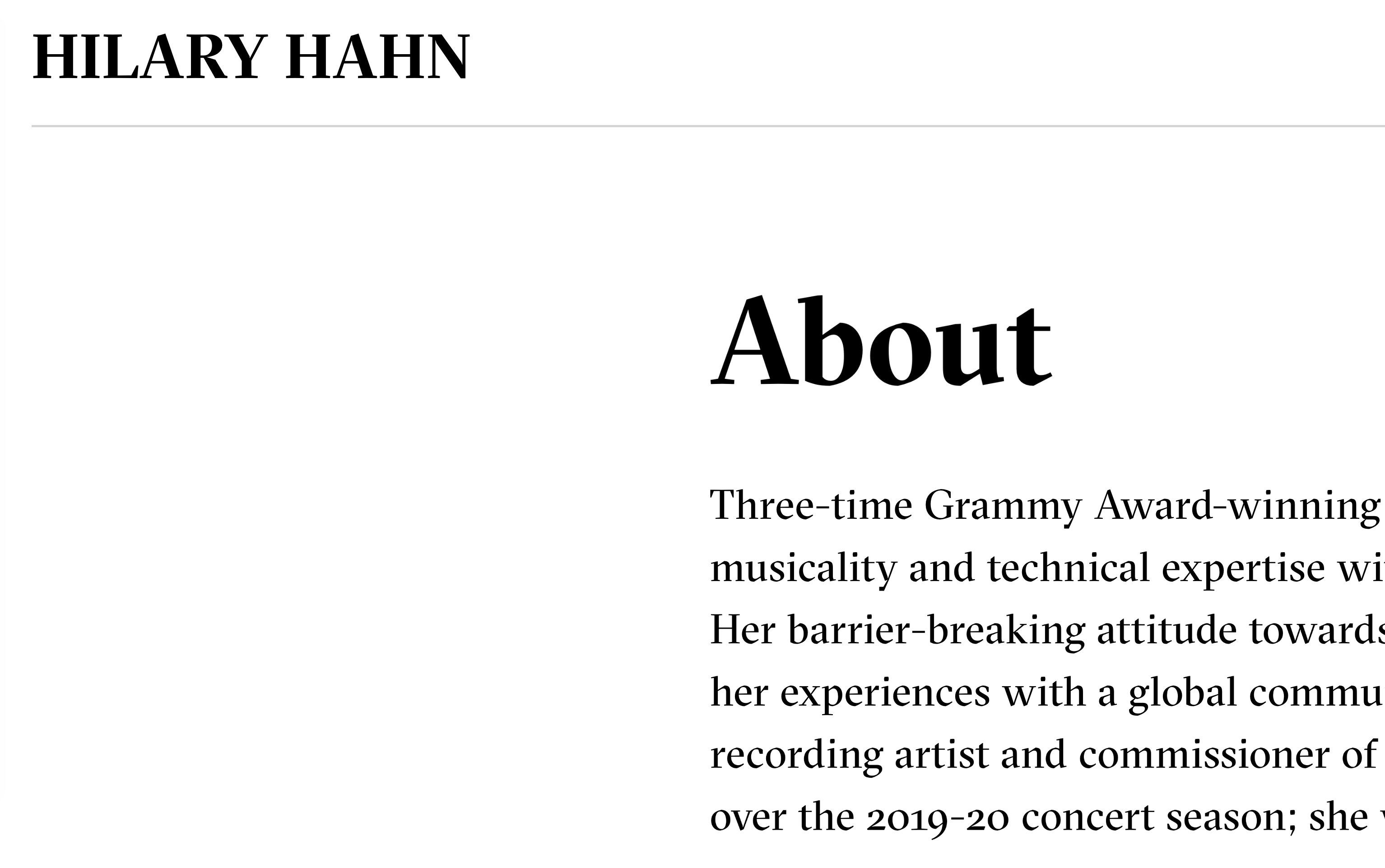
The GT Sectra typeface that her site uses is inspired by calligraphic strokes of the broad nib pen, as well as the historic blackletters. It's fascinating how they managed to combine the elements to make them show in such a modern font. You can read about its development stories here. It's a serif font, but its serifs look angular and geometric. Somehow it reminds me of her:

It's interesting to me that the font serves well both as display and body font. The texts look elegant when small, with lowercase numbers too.

To me the most critical step when creating the visual of a website is choosing the typefaces, particularly for sites that are text-based. While there are definitely many technical aspects in this topic, I think you can only get the spirit right if the typeface speaks for the site's owner, which I think is successfully done here.
Home of Hilary Hahn in the open web
Despite having long timeline of making websites, it only recently occured to me to think of a purpose of their existence. Most of the websites I make for others serve a functional purpose, or few. To display information, to share thoughts, galleries, etc. Until recently I ran into this idea that "completely makes sense" when I think of a personal website: it's the home of its owner in the open web.
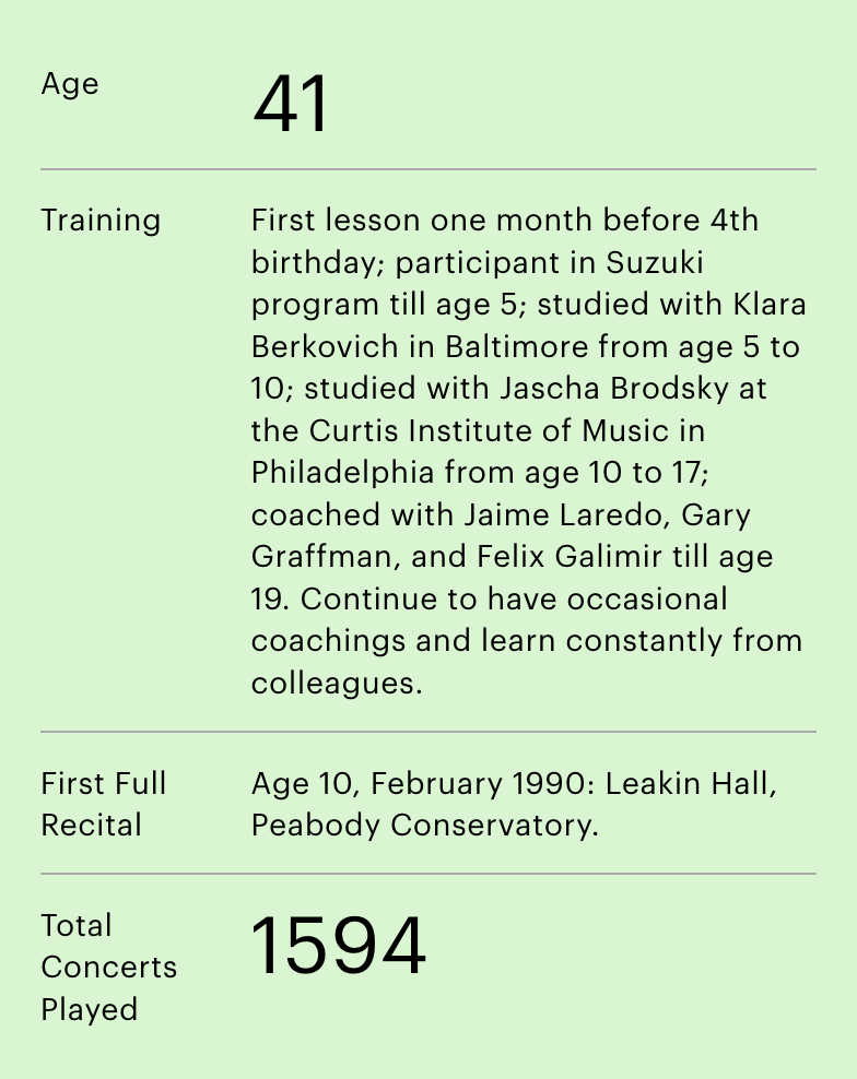
Try browsing her site while having this in mind, and enjoy what she shares with you as if you are a guest to her home. After welcoming you with a stunning animation, you are introduced to her glory and spirit as a musician. If you didn't want to take the effort to read, there's a stats bar that makes sure at least you don't miss out her astonishing facts as a soloist:

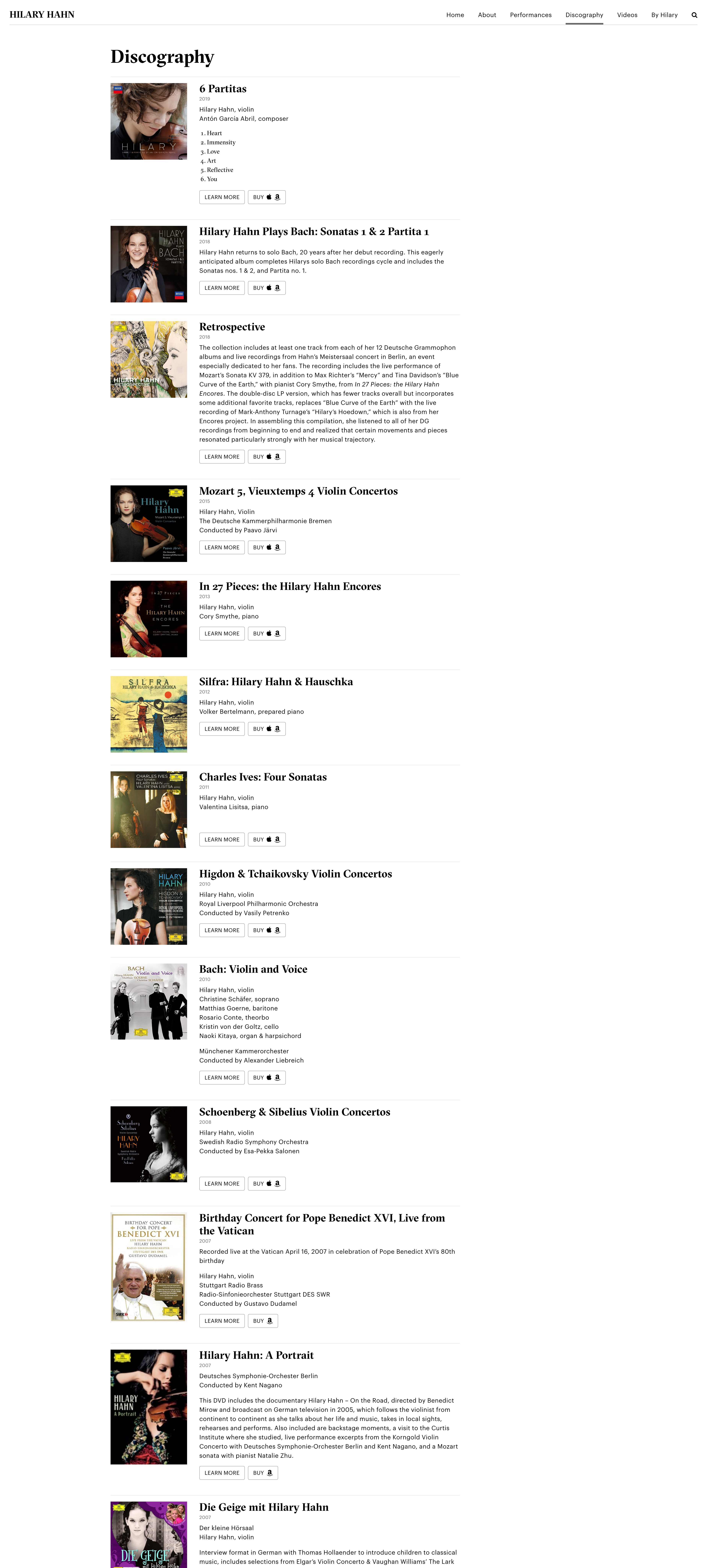
She then shares with you her past and upcoming performances. But then, I think my favorite is probably the discography page:

Once again, imagine visiting a musician's home and see a hall of recordings s/he has made. This probably isn't very space-efficient, and in my brain, which is half filled with nonsense, the scene easily goes south, i.e., a pianist pounding heavily on his baby grand, shaking all the records on the wall until they start to trip over..
Anyway, I really like how his discography listing occupies only a portion of your visual space and extends according to its timeline.
What Hilary shares with us
Hilary is prolific not just as a musician. She shares her thoughts in her blog and created and is still personally populating the Instagram hashtag #100daysofpractice. Clearly this is not a criteria for being a successful musician, and I still equally respect the other wonderful musicians who don't necessarily share so many aspects of their thoughts and lives in the public. I thought Hilary Hahn's commitment in putting up inspiring content in the open web is noteworthy, and again, how lovely a website she has :)